LUMIERE FESTIVAL SOCITEY
Crafted to Connect People with Lumiere, the Dashboard Simplifies Discovery and Engagement

TIMELINE
3 months
MY ROLE
Product designer
TEAM
1 PM
2 product designers
CONTRIBUTION
User interface design
User experience design
PROJECT OVERVIEW
Background
This project aimed to support the Lumiere Festival Vancouver Society in securing long-term investor partnerships by creating a digital dashboard that enhances partner engagement. Collaborating with two designers, I helped design an interactive platform that extends their website and visualizes key insights. We began by aligning with the team’s vision, reviewing existing research, and conducting user research to define clear solution opportunities and project goals.
The Problem
The Lumiere Festival Vancouver Society needed a way to secure long-term investor partnerships by improving engagement and providing clear insights, but their existing website and tools did not effectively support partner engagement or visualize key data.
The Result & Impact
The Lumiere Festival Society dashboard is currently in development with engineers and is designed to enhance partner engagement by visualizing key insights. Once launched, it is expected to help secure long-term investor partnerships and streamline the way the organization communicates impact to stakeholders.
97% Satisfaction Rate ↑
of users found that the interactive components were easy and fun to use.
10 - 15 Reporting Time ↓
Estimated reduction in manual reporting and data preparation per month.
25% Investor Renewal ↑
Higher likelihood of long-term partnerships via clear, interactive data presentation
How might we…
…how might we help investors easily understand the impact of the Lumiere Festival Society and feel motivated to maintain long-term partnerships?
THE SOLUTION
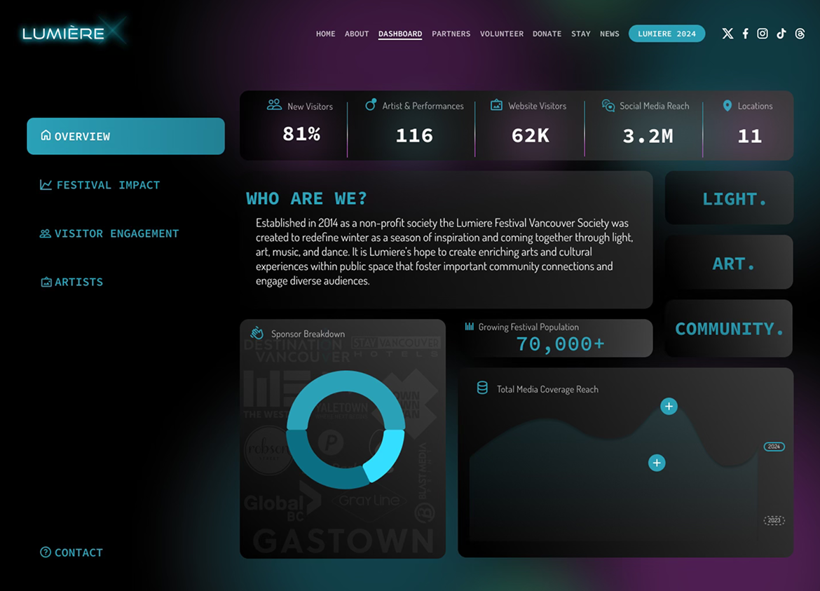
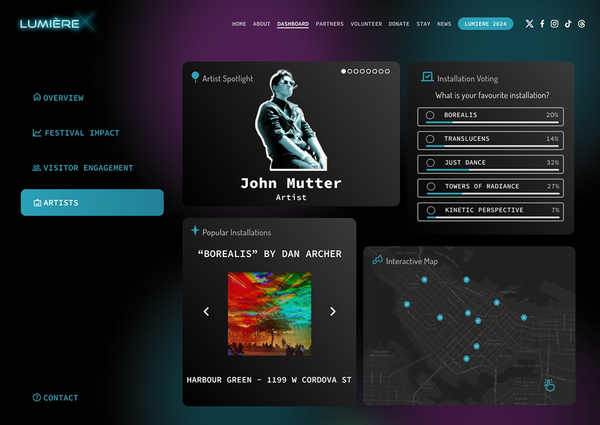
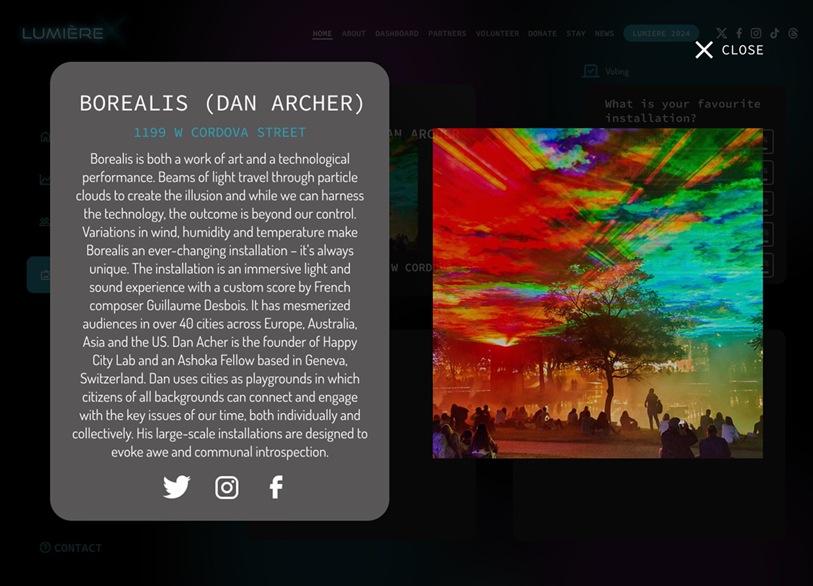
The Solution in Detail
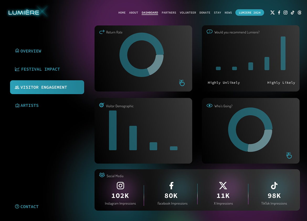
The solution was a custom digital dashboard designed to visualize key metrics, showcase impact, and provide festival partners with a clear, interactive overview of their involvement. By integrating data, storytelling, and design, the dashboard helps build trust, highlight value, and support ongoing partnership growth.
HOW DID WE START
Let's Get to Know the Festival
To kick off the project, my team and I began by reviewing the Lumiere Festival Society’s existing approach to partner engagement. One of the first things they shared was an infographic they used to present to investors, which immediately felt flat and lifeless to us which was completely opposite from the light, fun, and vibrant spirit of the festival itself. We also spent time learning about the festival’s goals, values, and audience to ensure our design would better capture its energy while addressing partner needs.
Challenge
There are critical gaps in the Lumiere Festival Society’s current investor materials that hinder partner engagement and long-term support due to multiple reasons.

Feeling Obsolete
Investor materials made the festival feel obsolete, missing its vibrant energy.
Lumiere’s 2023 Investor Infographic
Low Partner Engagment
Current solutions didn’t effectively connect with or retain investors.
Lack of Insight Visualization
Key festival and investor data wasn’t clearly communicated, making decision-making harder.
PRIORITIES
What We Want to Focus on
After gaining an understanding of the festival and identifying key challenges in partner engagement and investor communication, I collaborated with the project PM, another designer, and a key investor to conduct a workshop. The goal was to identify focus areas that would create the most value.
Interactive & Fun Experience
Designing the dashboard to feel engaging and lively, reflecting the festival’s vibrant spirit rather than static, flat materials.

Easy to Update
Ensuring the platform is simple for the team to maintain, add new content, and keep investor-facing information current without friction.
Clear Data
Presenting key information in a visually appealing and easy-to-understand way, so investors can quickly grasp impact and make informed decisions.
THE PROCESS
Brewing the Ideas & Sketching the Frames
Ideation & Exploration
With the insights and priorities in mind, we started with mapping out the userflow to align the product's features and functionality with user needs. We then toyed with different versions of Lo-Fi before presenting and gathering feedback to stakeholders.
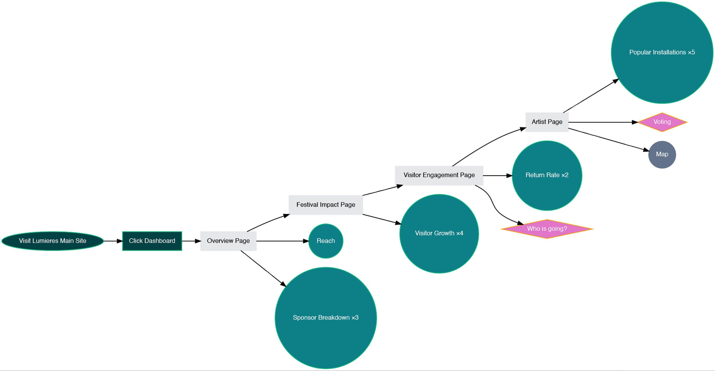
Lumiere Dashboard User Flow Chart

Artist Page
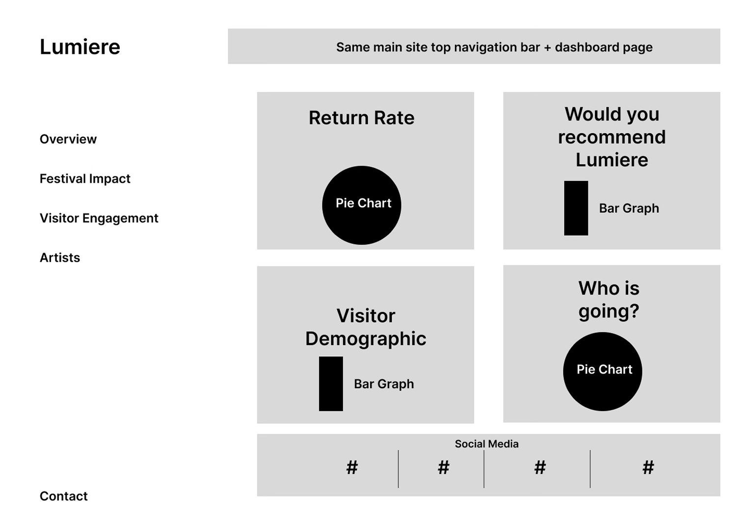
Visitor Engagement Page

Festival Impact Page

Overview Page
As the wireframes aligned with the goal and the needs of our user archetype, stakeholders agreed with the suggested design with only minor tweaks. With their approval, we then proceeded to the final stage visual brand identity and hi-fi design.


RETROSPECTIVE
What I Learned
— 01 Validating Interactions Early
I learned the value of testing interaction options early through prototypes and wireframes, which helped uncover usability issues and informed design decisions before high-fidelity development.
—02 Visual Hierarchy Impacts Usability
I realized that thoughtful use of layout, typography, and spacing can drastically improve how users interpret and interact with information.