
PLAYGROUND A FIGMA LEARNING PLUGIN

Empowering new designers to learn Figma faster through hands-on, personalized, and interactive learning
MY ROLE
Product Designer
TIMELINE
5 months
TEAM
1 product designer
CONTRIBUATION
User experience designer
User interface designer
PROJECT OVERVIEW
Background
As my final project at Vancouver Film School, this 5-month-long UX/UI project aimed to design a plugin that helps beginners learn Figma through hands-on, low-pressure exploration. From discovery and research to prototyping and testing, this project followed the full UX/UI process from start to finish. I primarily used Figma to design the interface and interactions, Adobe Photoshop to create high-fidelity mockups, and After Effects to produce supporting video materials. Throughout the project, I deepened my understanding of the importance of thoughtful planning and always grounding my design choices. This experience not only sharpened my technical skills, but also strengthened my confidence in building meaningful, user-centered digital products.
The Problem
Beginners often find Figma intimidating and difficult to learn, lacking a supportive way to explore and practice without pressure. There is a need for a tool that guides new users through hands-on, approachable learning directly within Figma.
The Results & Impact
Design System
developed a full design system to ensure consistency, scalability, and efficiency across the plugin’s interface and interactions
92%+
of testers reported increased confidence navigating Figma after using the plugin
94%+
of users completed tasks with fewer errors after exploring the plugin features
95%+
said they would recommend the plugin to other Figma learners
How might we…
…how might we help beginners learn Figma through hands-on, low-pressure exploration directly within the tool?
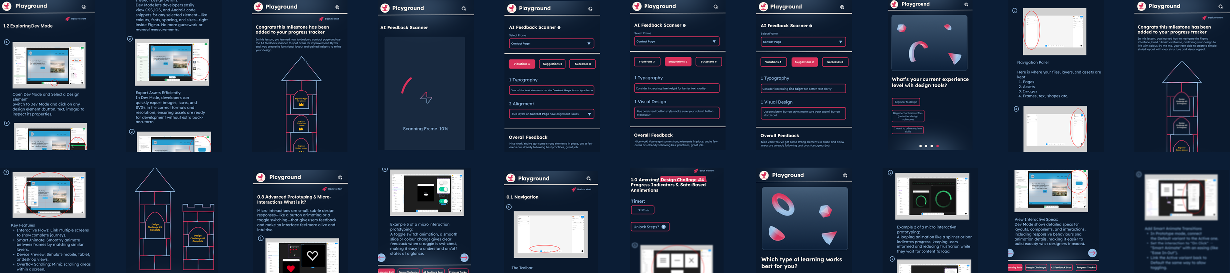
SOLUTION BREAKDOWN
The Solution in Detail
The solution was a Figma learning plugin designed specifically for beginners. The plugin provided an approachable, interactive environment where users could explore Figma’s tools and features without the intimidation of traditional tutorials. Instead of overwhelming users with dense instructions, the plugin emphasized guided, hands-on exploration and low-pressure practice exercises that reinforced learning through doing.
HOW DID I START
Understanding my Users
To uncover user pain points, I conducted research with beginners learning Figma and quickly noticed a pattern, many felt overwhelmed by the interface, unsure where to start, and hesitant to experiment for fear of making mistakes. These insights highlighted the need for a learning experience that felt approachable, supportive, and encouraged hands-on exploration without pressure.
❌ Problem
Users feel overwhelmed or disengaged by long tutorial intro videos that delay hands-on learning
❌ Problem
Even after watching, users feel stuck because the learning doesn’t stick
❌ Problem
Users are frustrated when tutorials over-explain instead of showing actionable steps
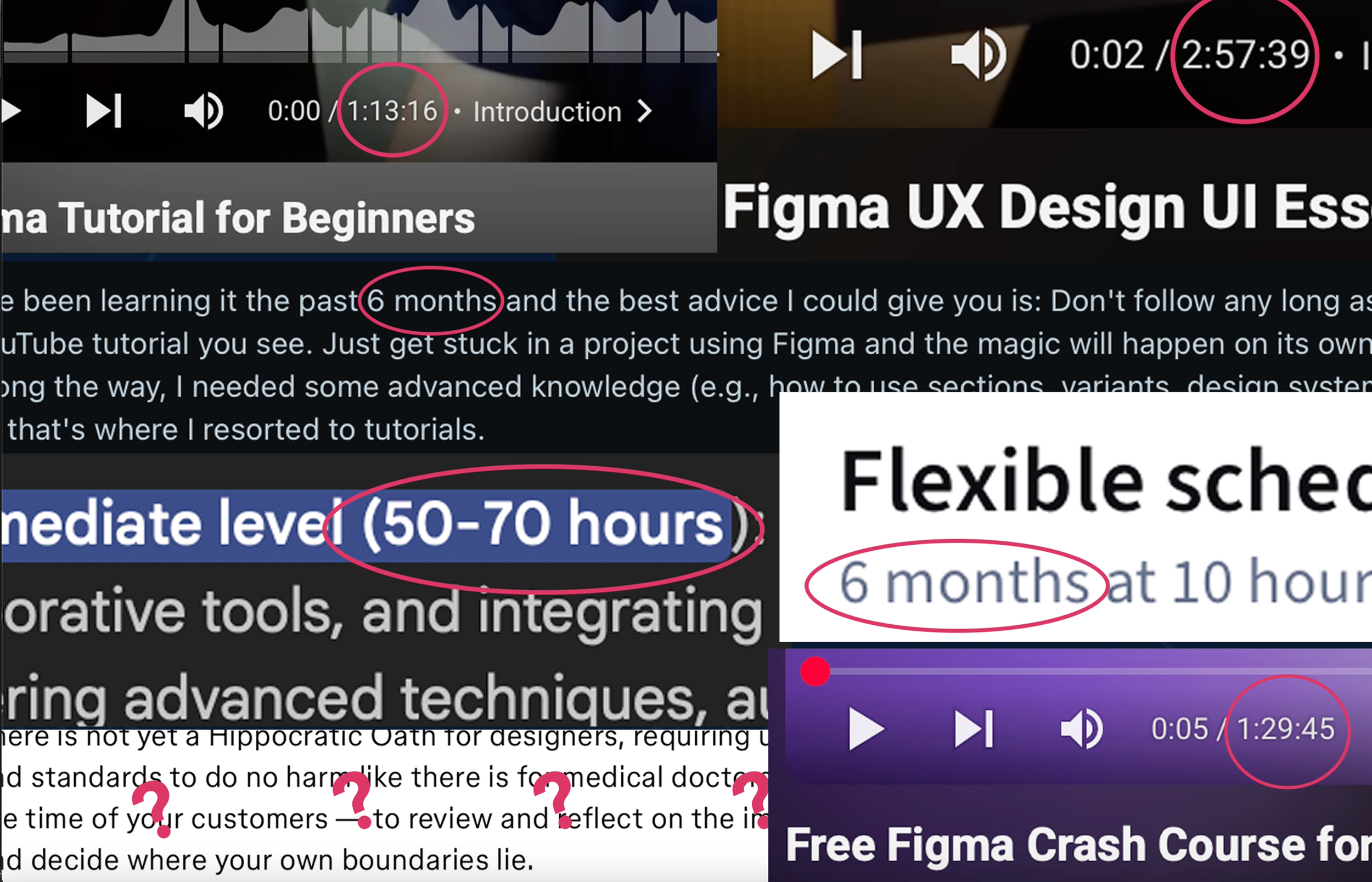
Average Beginners Problem Space
Delve Deep Into Research
For my Figma learning plugin project, I conducted extensive research to understand the current landscape of design learning tools. I explored everything that existed, from tutorials to interactive plugins, with the goal of identifying what worked well and where users were struggling. By analyzing both the strengths and flaws of existing resources,
RESEARCH
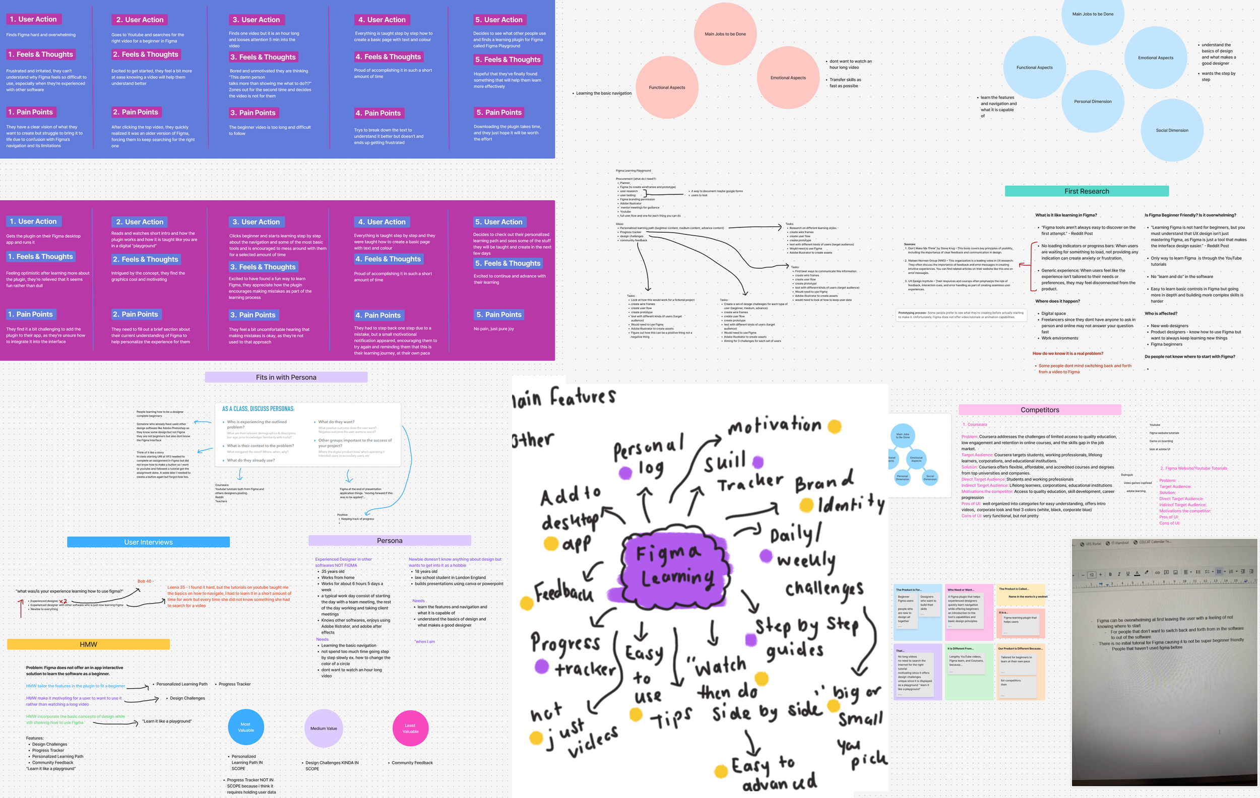
Research

Key Takeaways
01 — Overwhelm is Common
Beginners often feel intimidated by the amount and complexity of current resources
02 — Interactive Learning is Most Effective
Hands-on exploration is more engaging and effective than passive content
03 — Need for safe Experimentation
Few tools let users learn by trying things without fear of mistakes
USER PERSONAS

Personas
To prioritize the most critical problems and address the significant needs of key user groups, we created two personas representing these audience segments. This approach enables us to focus our efforts effectively.

Persona 1
Persona 2
THE PROCESS
Crafting Solutions Behind the Scenes
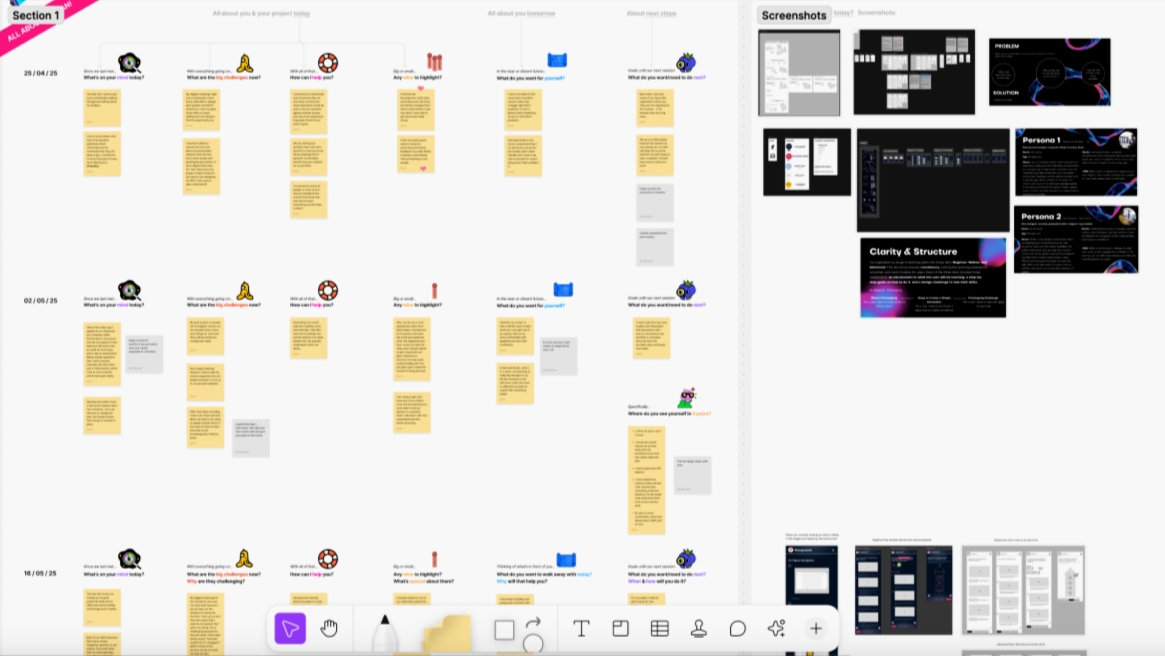
Let’s take a look behind my design process. Since this was a solo project, I wore many hats, serving as the product designer, researcher, and project manager 💁. I began by setting clear objectives and mapping out the approach, which included researching existing learning tools, identifying pain points, and analyzing gaps in the market (refer to my research section above.) From there, I moved through the full design cycle ideation, wireframes, prototyping, user testing, and iteration, taking full ownership of both the vision and execution of the plugin.
Ideation & Exploration
For the low-fidelity phase, I focused on creating sketches for one main user flow and the accompanying website layout. Since the structure and interaction patterns would remain consistent across different lessons or content within the plugin, I didn’t need to sketch each variation separately, only the content would change. This approach allowed me to efficiently plan the overall experience while maintaining consistency across the learning journeys.
SKETCH
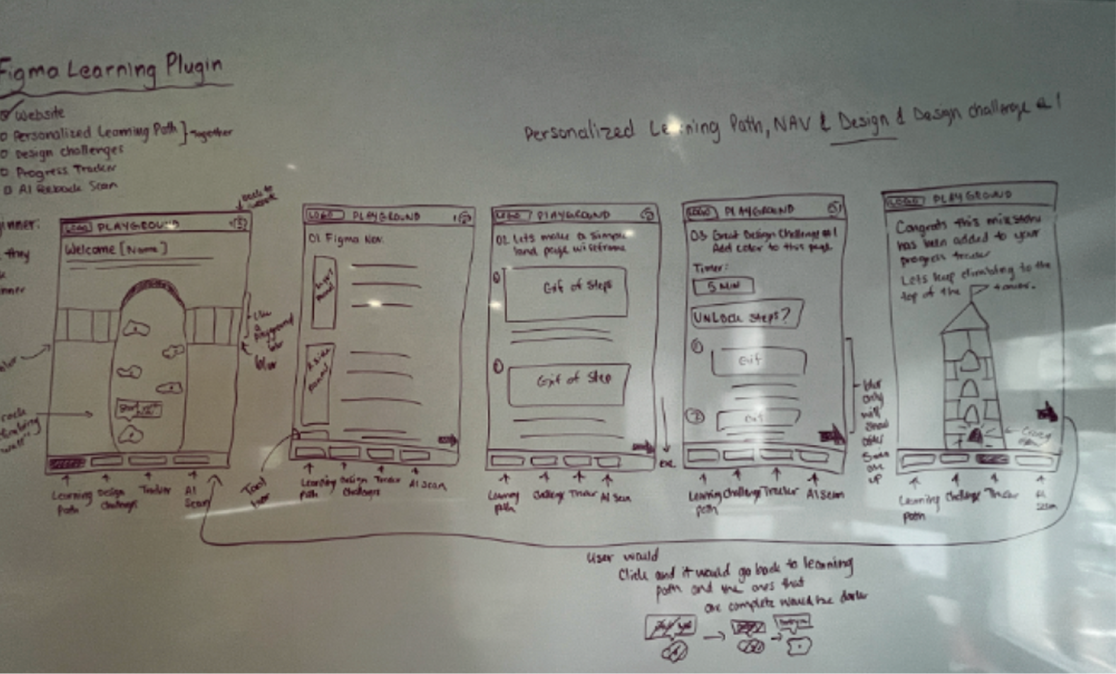

Learning Path Flow 1
Playground Website
WIREFRAMES
Low-Fi Wireframes
After finalizing the direction from my sketches and feedback sessions, I developed low-fidelity wireframes to map out the structure and interactions of the entire plugin and website. These wireframes helped visualize user flows, content hierarchy, and interaction patterns, ensuring the learning experience felt intuitive and cohesive. This stage was crucial in refining usability and setting a strong foundation before moving into high-fidelity design.


LOGO & BRANDING
Introducing Playground
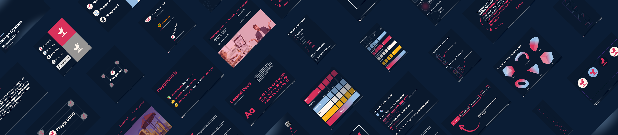
Before moving into the UI design phase, I began by defining the core concept and visual identity for the Figma Learning Playground. I wanted the brand to feel approachable, creative, and inspiring, reflecting the fun, hands-on nature of learning design. The name Playground naturally captured this idea: a space where users can freely experiment, explore, and build their design skills in an encouraging environment. While developing the brand direction, I identified the key attributes and keywords that guided the tone and visuals: #friendly, #playful, and #empowering.

Design System
Due to time constraints, I developed the design system for the Figma Learning Playground in just three days, focusing on efficiency and clarity without compromising visual quality. The system established a clean, approachable aesthetic that reflects the plugin’s friendly and educational purpose. It includes a balanced color palette, rounded typography, and playful yet minimal UI elements to create an engaging and consistent learning experience. The design system served as the foundation for all high-fidelity screens, ensuring visual coherence and streamlined scalability across the plugin and website. (Design system file available upon request.)
HIGH- FIDELITY DESIGN
Togetherness
With the visual style defined for the UI design and wireframes ready, it's time to put things together.
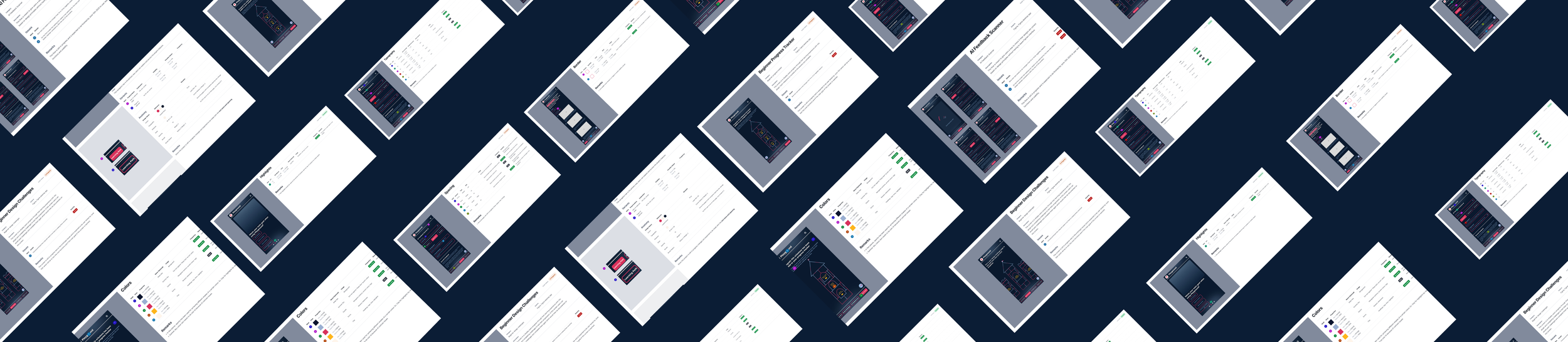
DESIGN AUDIT
Visual Design Audit
To ensure a cohesive and user-focused interface, I conducted a thorough visual design audit across each section of the Figma Learning Playground. I evaluated all design aspects, including typography, colour usage, iconography, spacing, and component consistency, while aligning them with the plugin’s brand attributes. This process helped identify areas for improvement, guided refinements in hierarchy and readability, and ensured that every interaction and visual element supported a seamless, engaging learning experience. Each section was reviewed and iterated to maintain consistency, clarity, and visual harmony throughout the platform. (Visual design audit file available upon request.)
TESTING
User Testing
During the user testing phase my main goal was to evaluate how users interacted with the interface and how intuitive the key interactions felt throughout the learning flow. I focused on observing how easily users could navigate between sections, trigger tooltips, and complete tasks without hardship. One concern I paid close attention to was text accessibility, as I wanted to make sure the type sizes and contrast levels were readable for a wide range of users, especially within smaller interface components. This phase provided valuable insights into refining both usability and visual clarity before finalizing the design.

Insights
01 — Text Size Adjustments
Some text was too small so I increased the font size for better readability
02 — Interaction Dead End
Two users got stuck in a flow so I fixed the navigation to guide them better
03 — Feedback Animations
Testers wanted more feedback so I added small animations after actions
GUIDENCE
Mentorship
I had the privilege of being mentored by Robert Westwood, a Design Manager at Autodesk and an experienced instructor. We met via Zoom each week to discuss key design topics, but our conversations often went beyond work to focus on life and the habits needed to produce high-quality work. His guidance was incredibly helpful, and I continue to stay in touch with him today. I truly feel that without his mentorship, I would not have grown as an individual or developed the confidence I now have in myself and my work.
Mentorship Document
RETROSPECTIVE
What I Learned
01 — Overcoming Public Speaking Fear
Through 15+ presentations, I learned that I knew my project better than anyone in the room. Owning that knowledge helped me overcome the fear of speaking confidently about my work.
02 — The Importance of Understanding the Why
As a product designer, learning new tools is just a fraction of the job. The real impact comes from deeply understanding the problem and the reasoning behind every design decision.
03 — Advocating for Myself
I realized that speaking up for my ideas, needs, and contributions is crucial to both personal growth and the success of the project.
