
Role
Creative Direction / Design / UI / UX
Project
Brand Identity / Packaging / E-Commerce
Agency
Independant
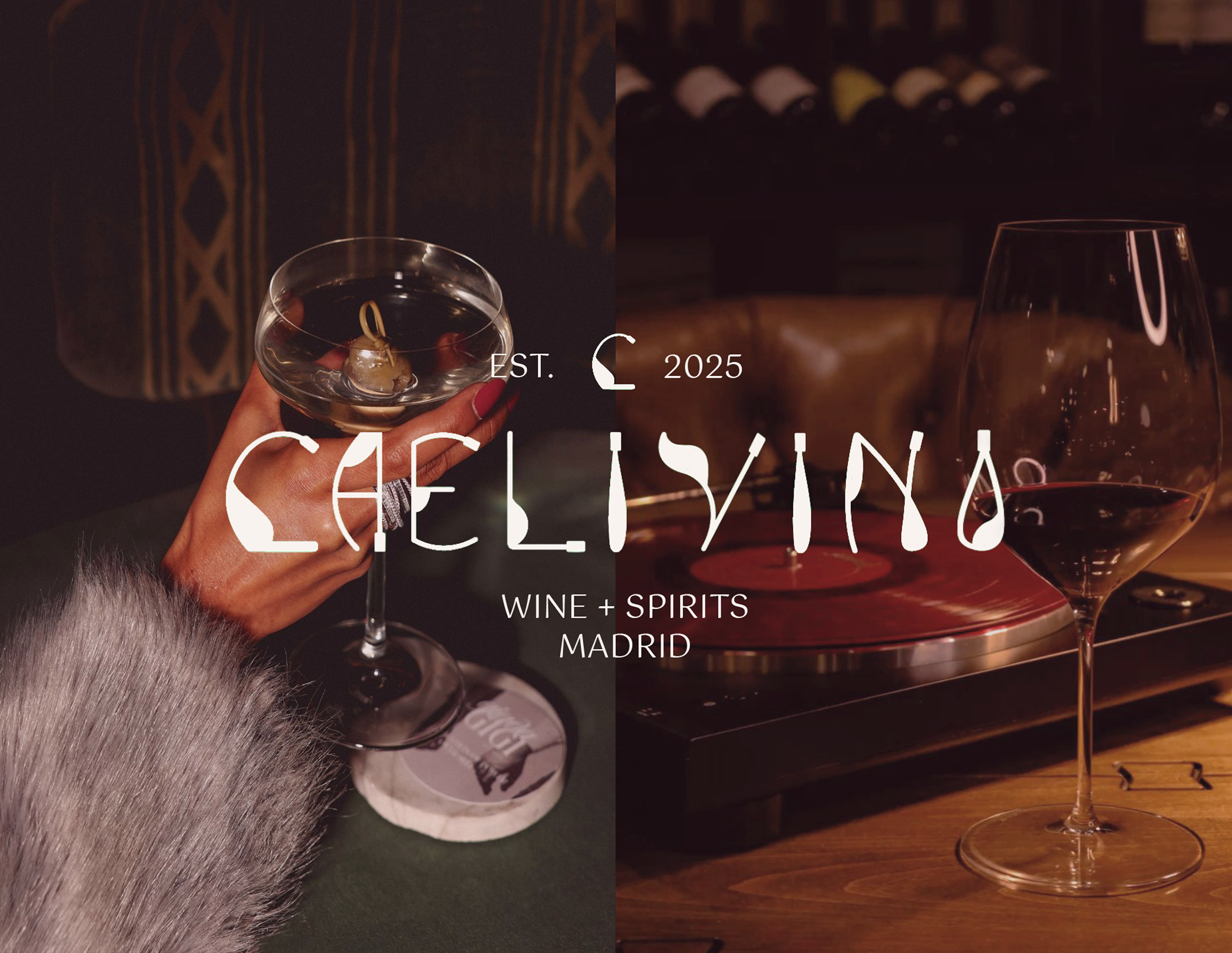
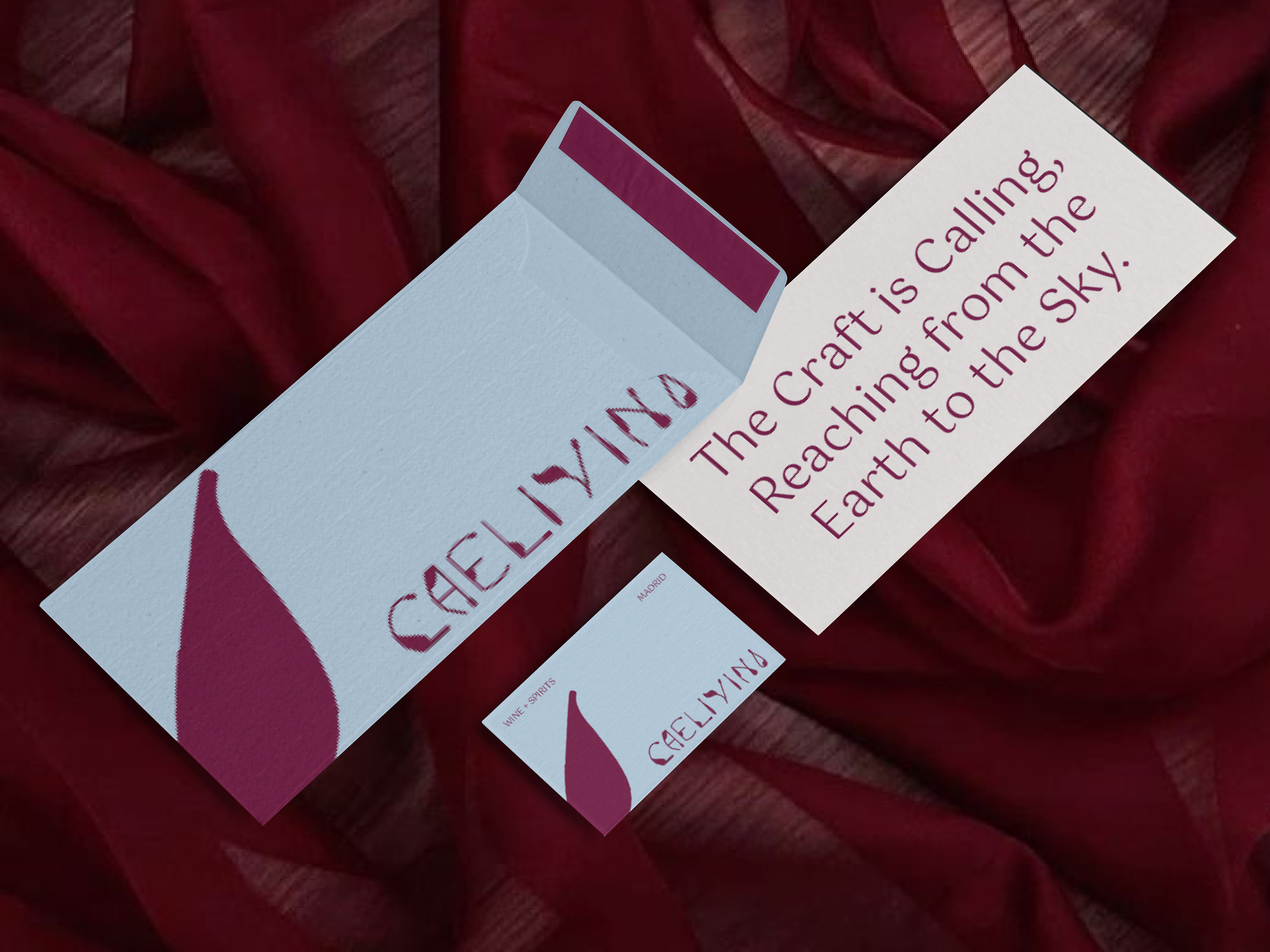
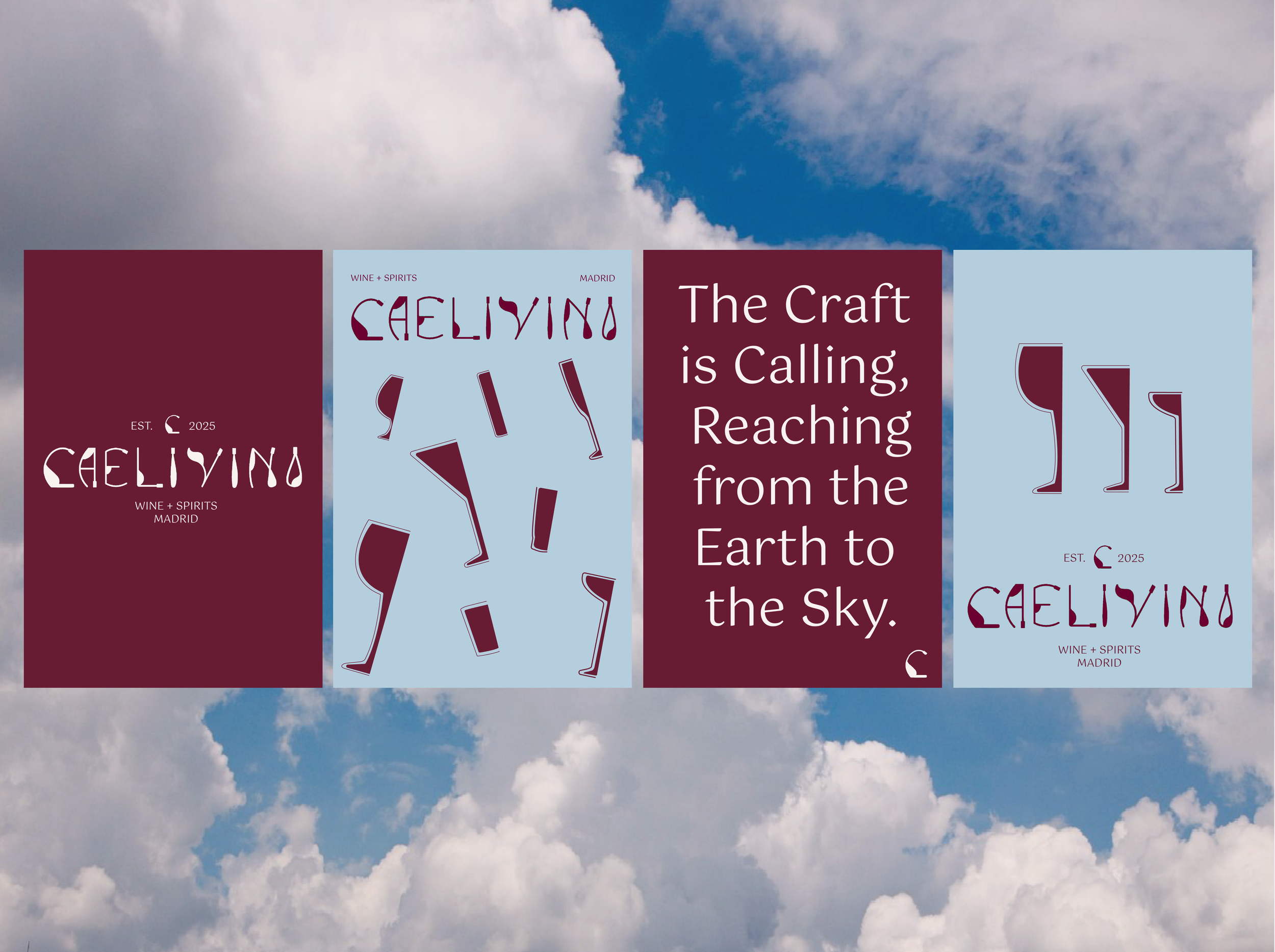
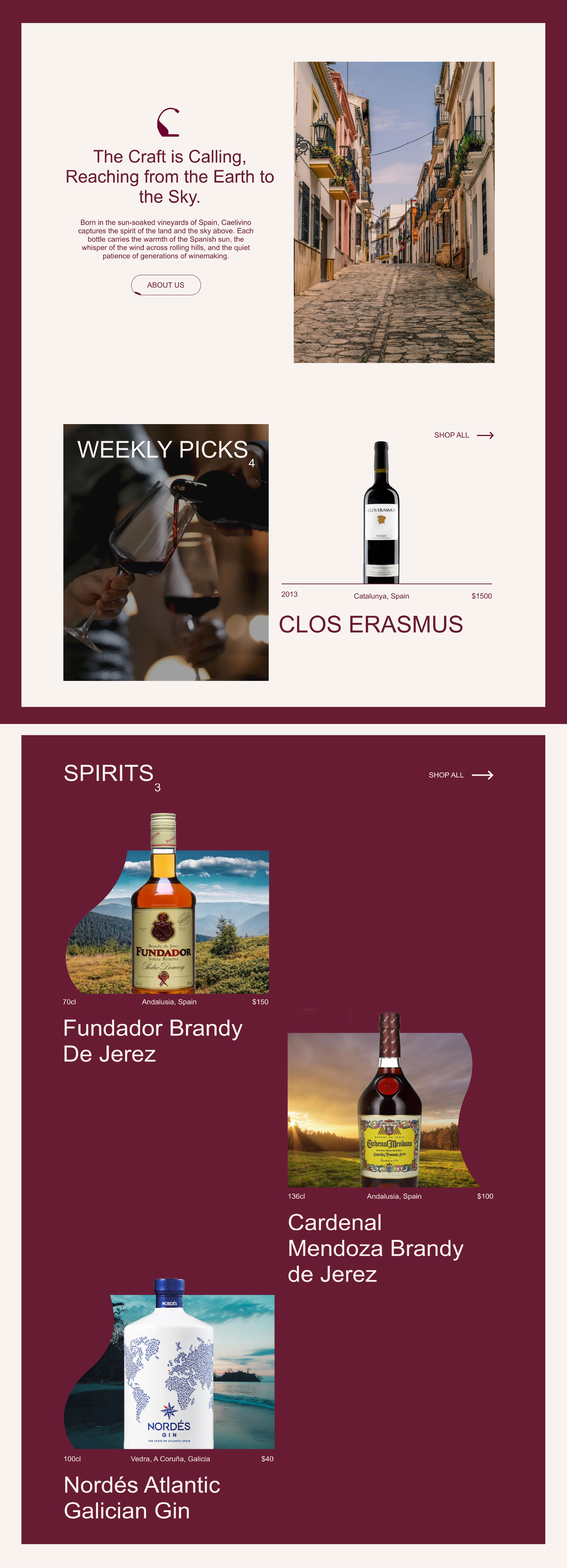
The Craft Is the Calling…
Caelivino is a bold, modern Madrid-born wine & spirits house that blends celestial inspiration with Spanish artistry. Every bottle is crafted with intention, elevating local ingredients, reimagining tradition, and bringing a fresh, sophisticated edge to the world of wine and spritz culture. Caelivino isn’t just a drink, it’s a mindset, a movement, and a new way to savour the spirit of Madrid. ☁️
THE PROBLEM
Hidden Luxury. Missed Experiences.
While people appreciate fine wine, building a meaningful connection is not always straightforward. Quality wine can feel distant or intimidating, leaving the enjoyment it offers under appreciated. The challenge was not demonstrating that Caelivino produces exceptional drinks, but fostering an emotional connection to the brand. The primary issue was limited brand awareness. Caelivino required a strategy to position luxury wine and spritz as approachable, engaging, and memorable, while maintaining a modern and sophisticated identity.

The Craft is Calling, Reaching from the Earth to the Sky.
THE SOLUTION
It Was Time For a Change
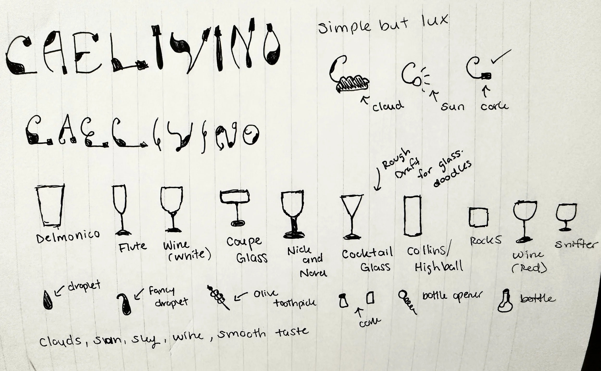
Caelivino needed a way to stand out in a crowded market and connect with people who had never experienced the brand. Drawing on consumer insights, we explored multiple creative directions before arriving at the one that perfectly captured the brand’s essence, sophisticated, approachable, and sky-inspired.
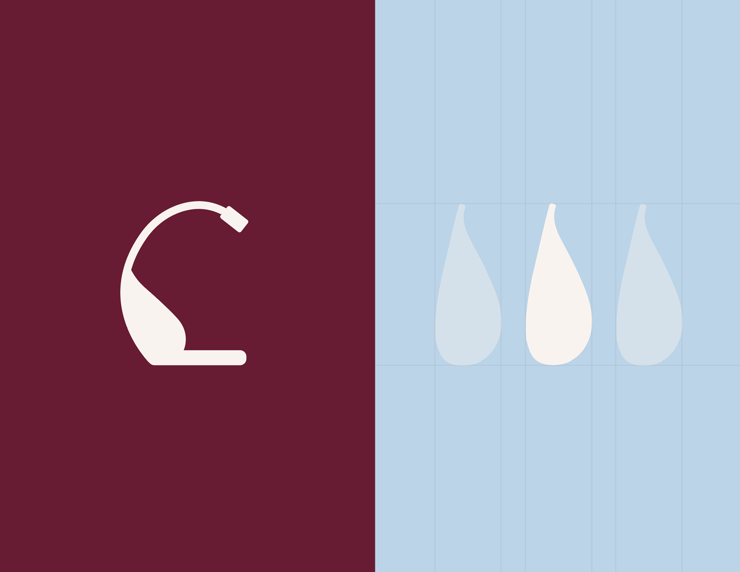
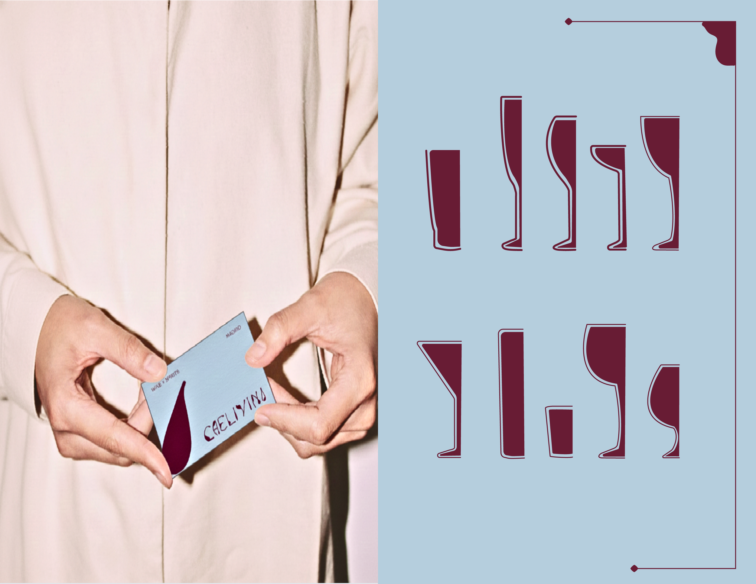
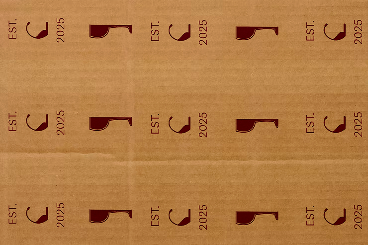
The brand was refreshed with a new logo, custom icons, a modern colour palette reflecting sky blue, clay white, and burgundy tones, and elegant memorable brand fonts. The new identity was applied across all touch points, creating a cohesive and elevated presence for Caelivino.
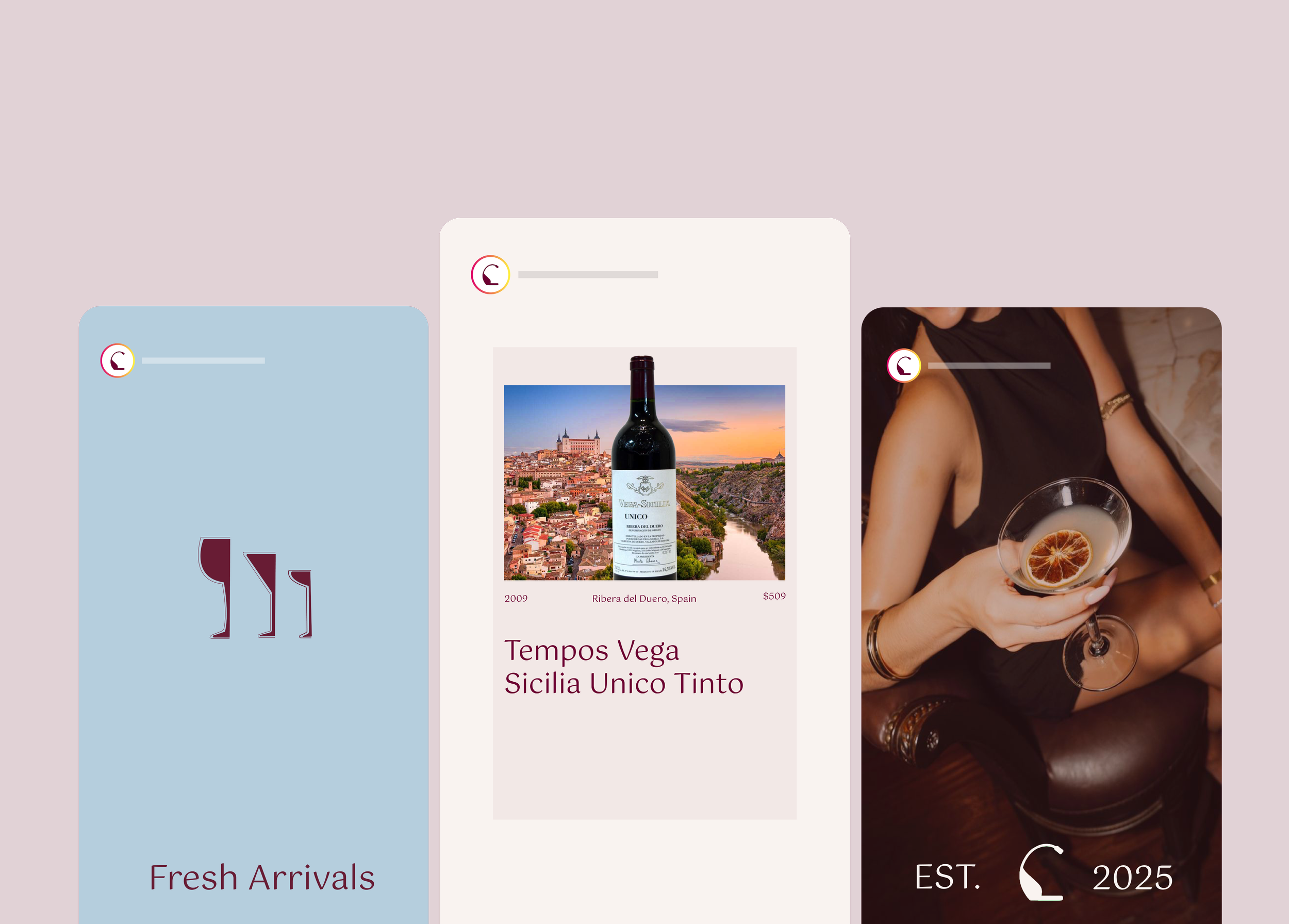
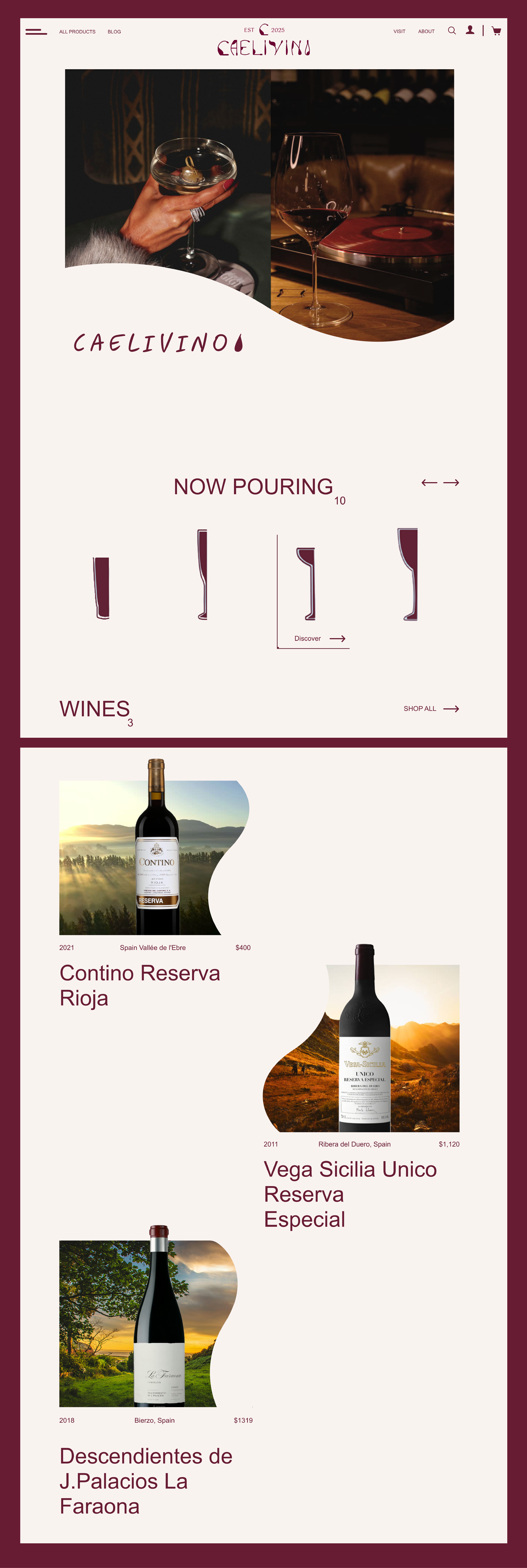
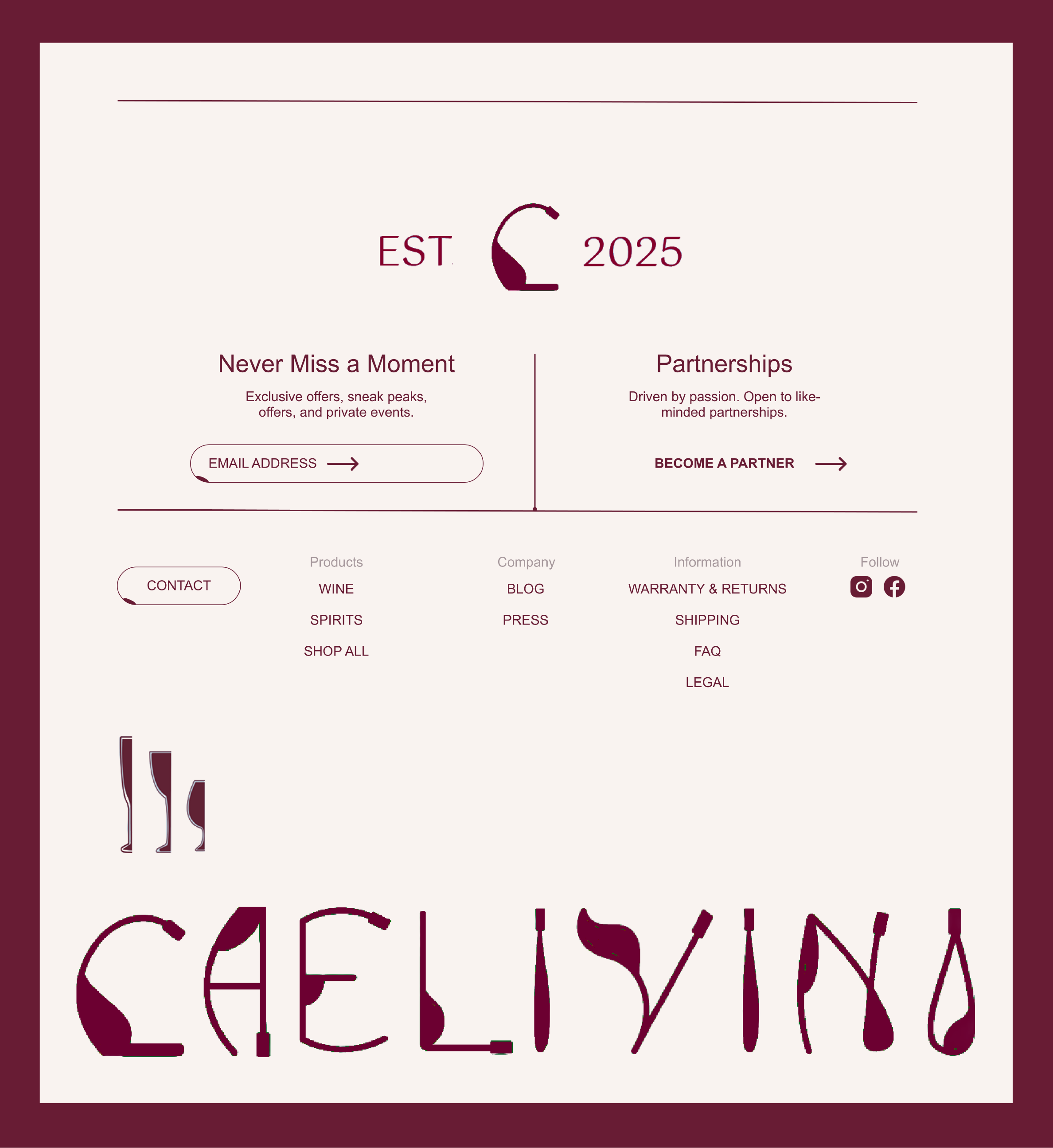
WEB DESIGN
A Complete Refresh
I focused on creating a clean, modern experience that feels fluid and intentional. The layout and visual pacing were designed to mirror the motion of pouring wine into a glass, smooth, continuous, and unforced. I used generous spacing, restrained typography, and a refined color palette to let the brand breathe while guiding the user naturally through the site. The goal was to create a sense of quiet elegance, where navigation feels seamless and the product remains the focal point.
RETROSPECTIVE
What I Learned
01 - Designing for Flow and Movement
I learned how layout, pacing, and hierarchy can create a sense of motion in this case, inspired by the smooth act of pouring wine. This helped me think more deliberately about how users move through a page.
02 - Balancing Minimalism with Character
I learned how to keep the design clean and modern while still expressing Caelivino’s personality. This meant making intentional choices with typography, colour, and imagery so the brand felt refined, not stripped back.
03 - Research-Driven Design Decisions
Working in an unfamiliar space taught me to rely more heavily on research rather than assumptions, helping me design with greater intention and credibility.